Wallace & Gromit: Penguin of Crime


Overview
Play as Wallace & Gromit’s most fowl foe, Feathers McGraw! A concept of a game that primarily focuses on the UX work, with game design and UI Art to support.
My Role
UX/UI Designer
Game Designer
Created low and high fidelity wireframes, site maps, flows of important features, and UI Art
Objective
To create a heist game based off of Wallace & Gromit with UX/UI that would fit within the world semi-diegetically.
Solution
Information Clarity
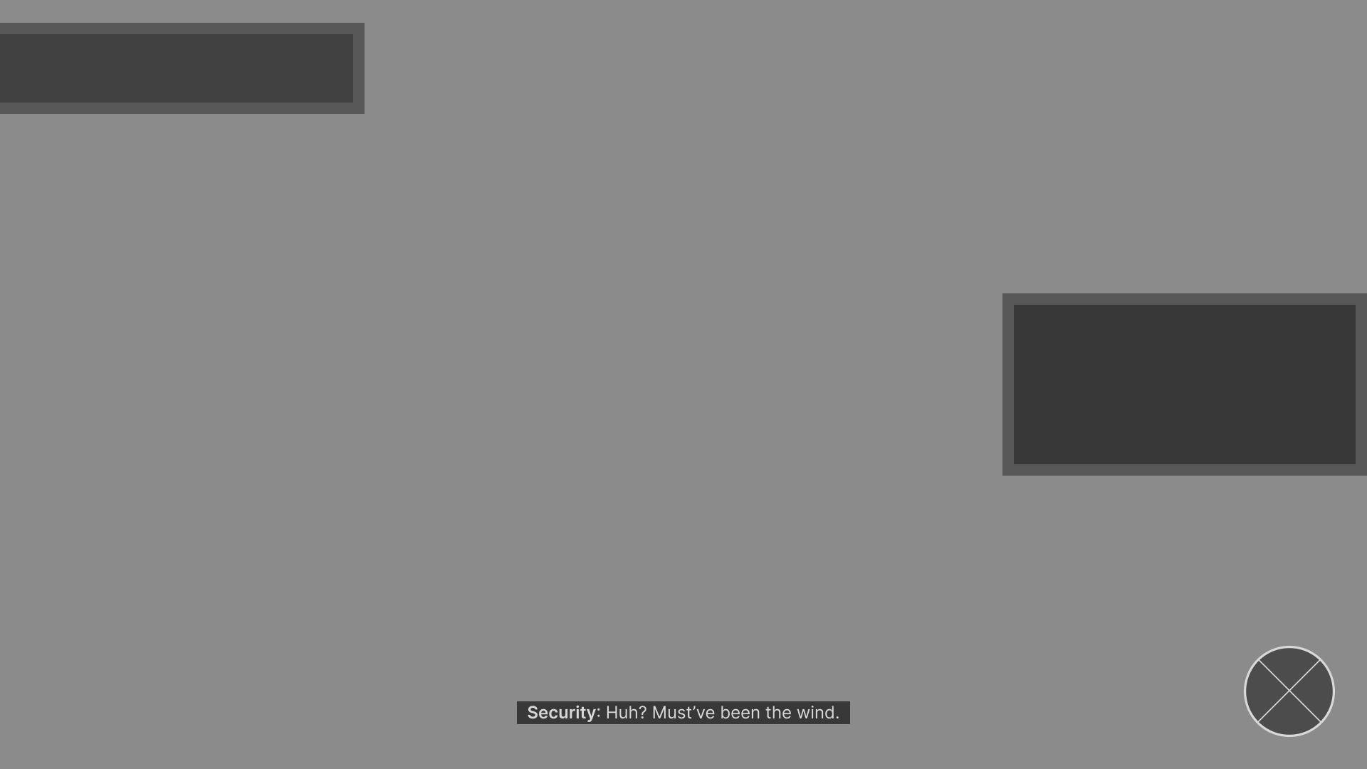
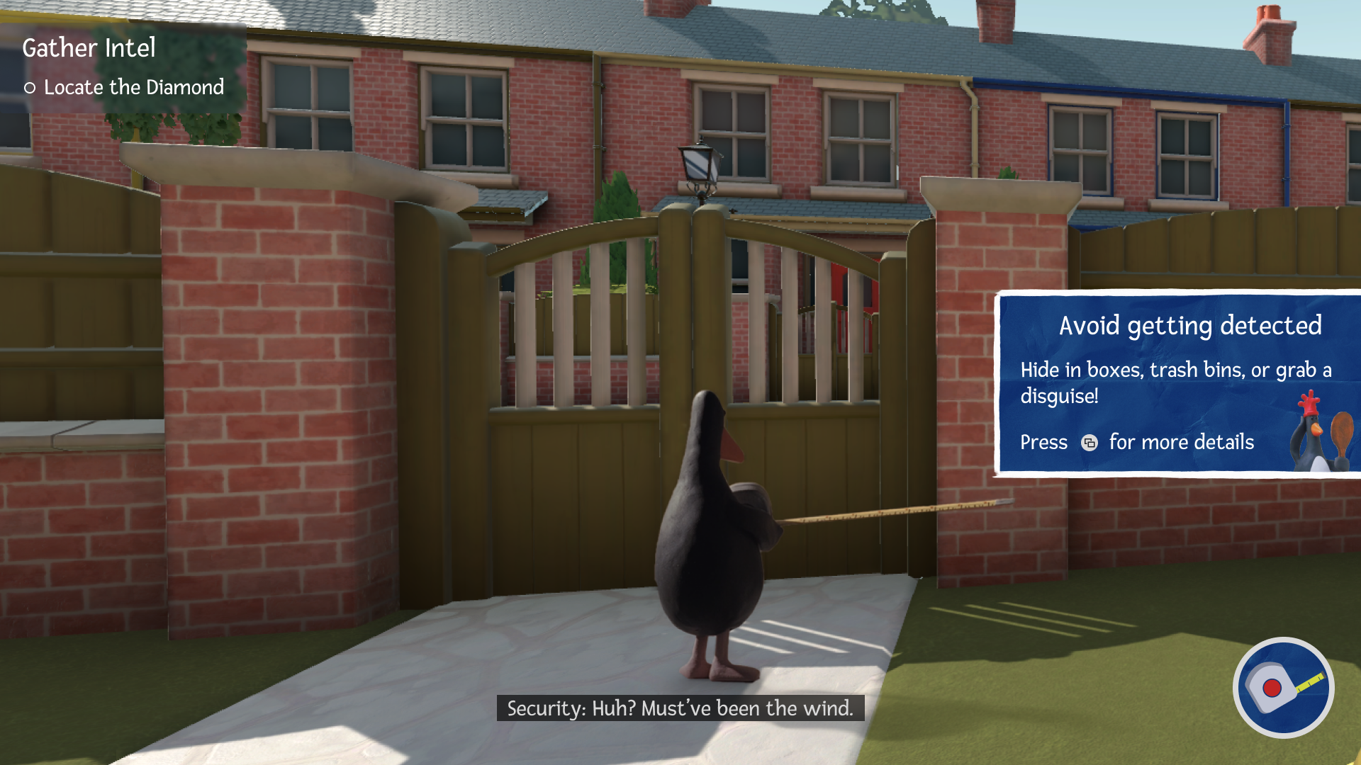
It was important for me to not obscure information for the player and make the intentions of what’s on the screen clear. This means; not blocking text, increasing legibility and grabbing players’ attention when important to name a few.
Low-Fi Wireframes
Process
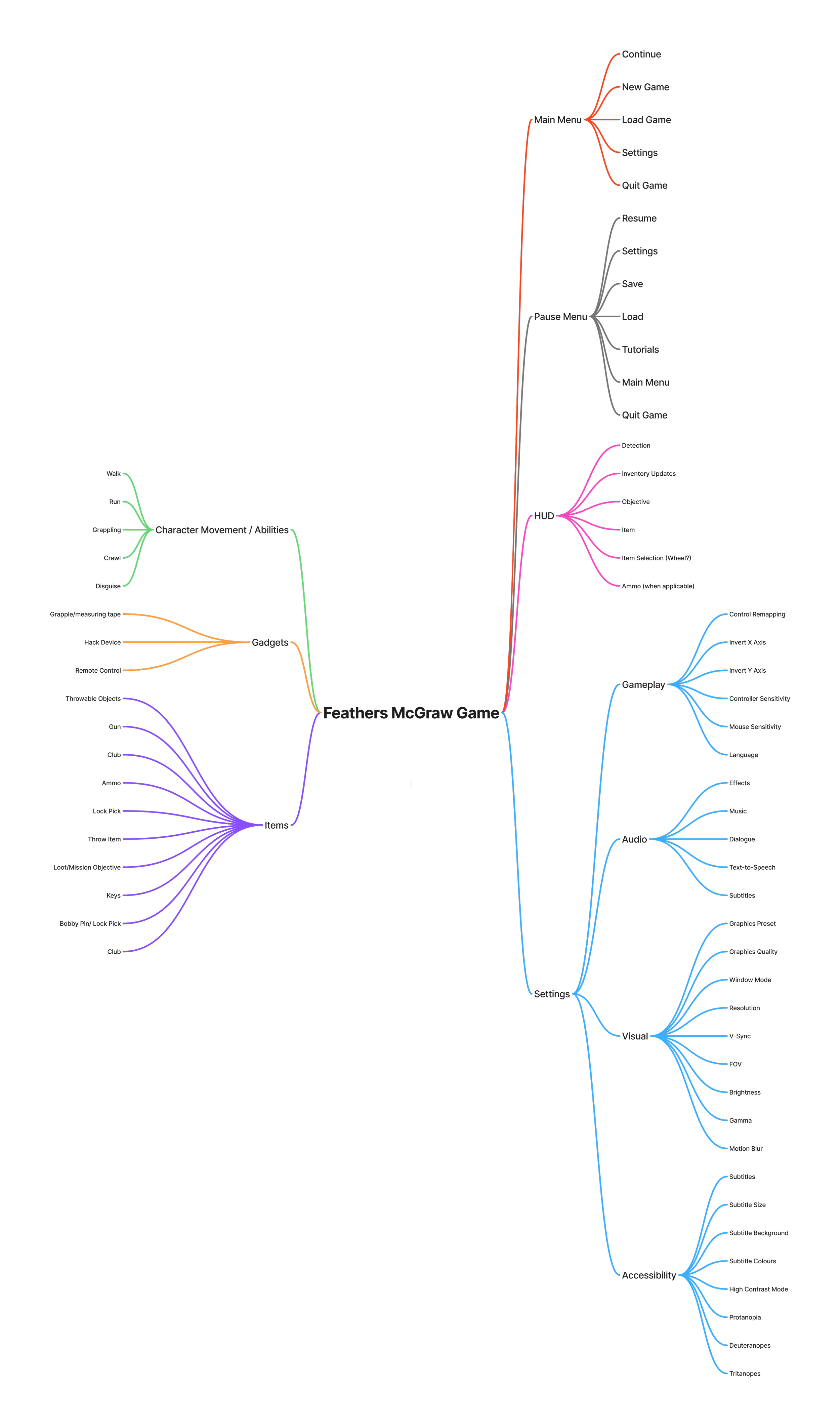
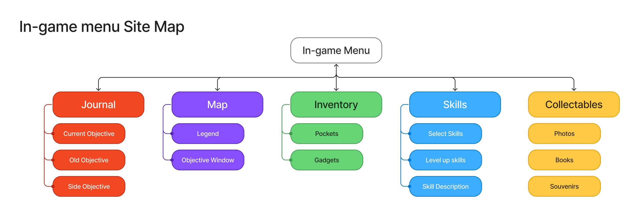
Feature Map & Sitemap
Time
~2 Weeks
Tools
Figma, Figjam
Semi Diegetic UI
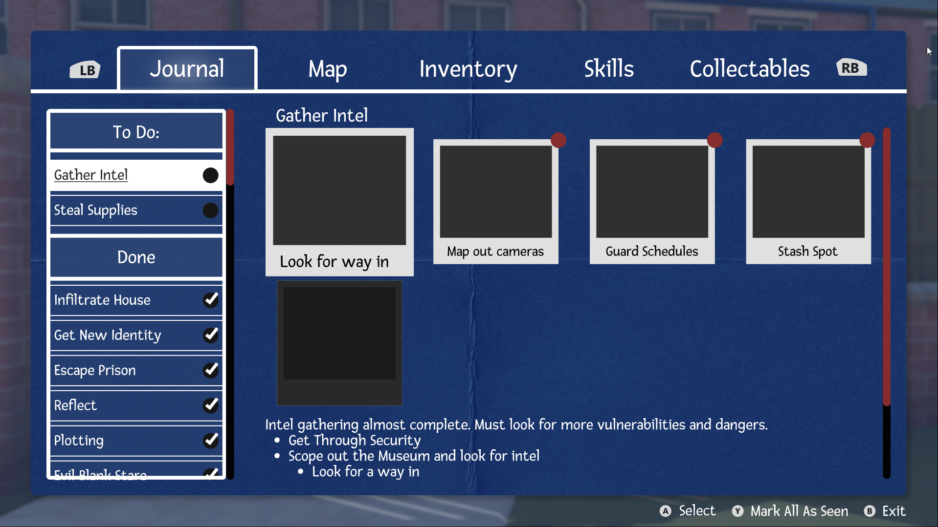
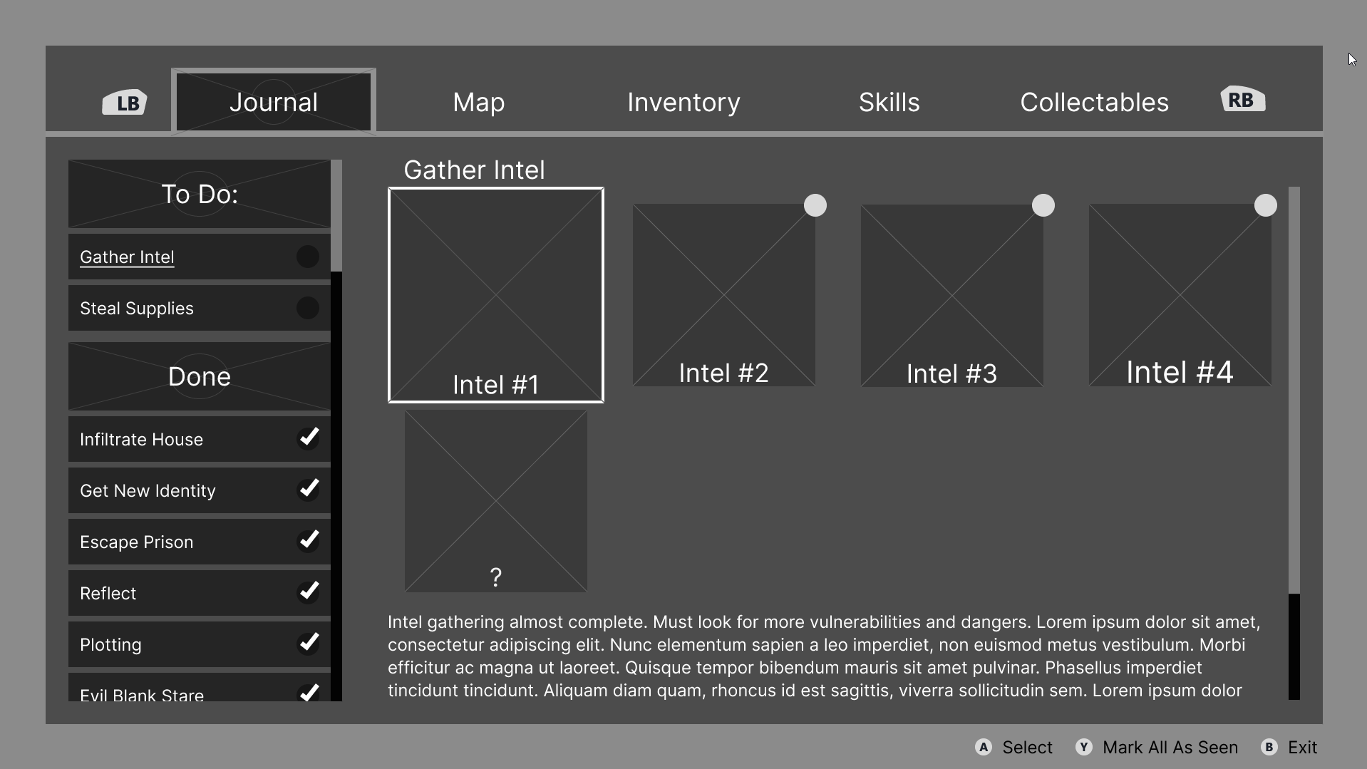
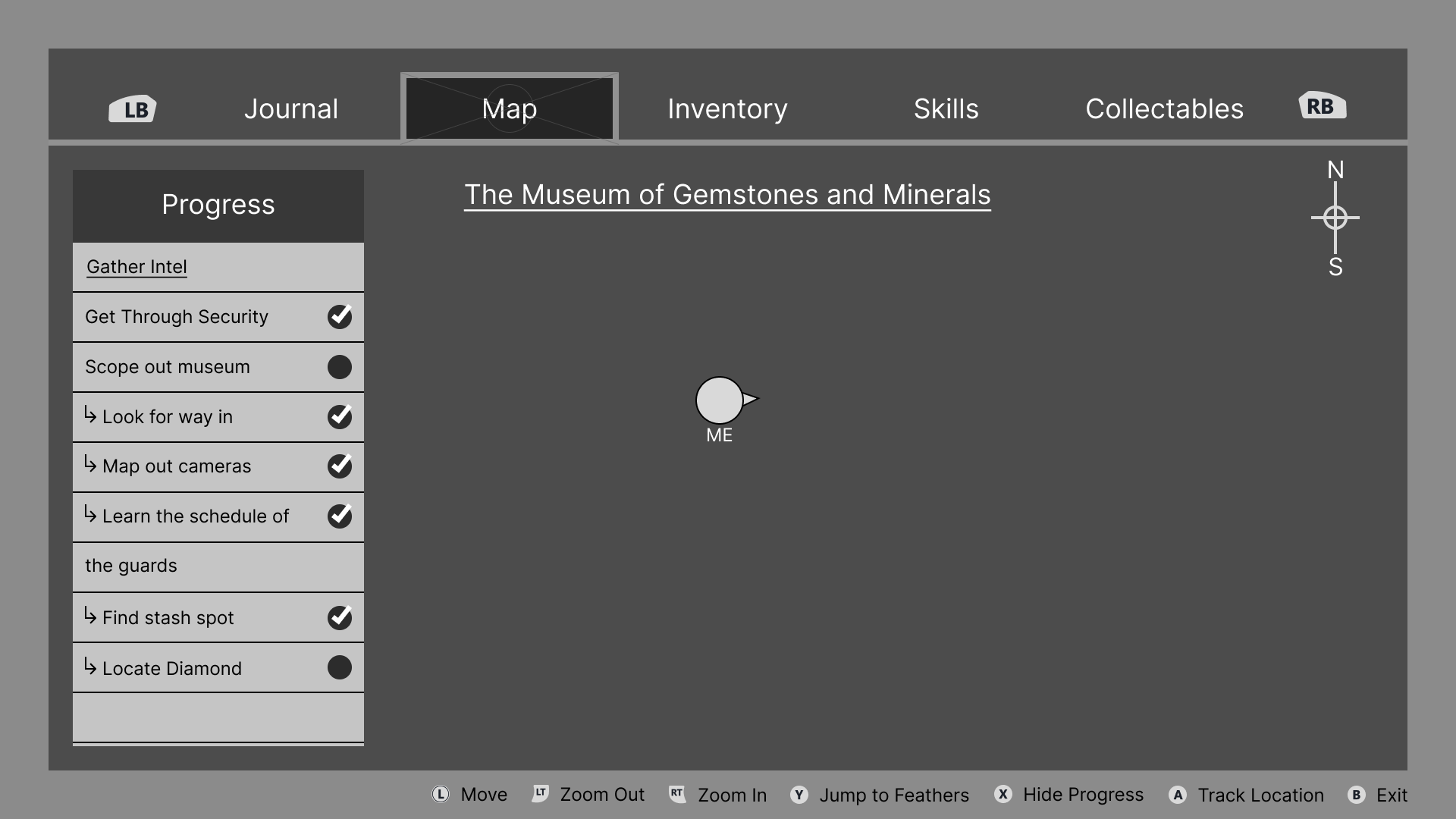
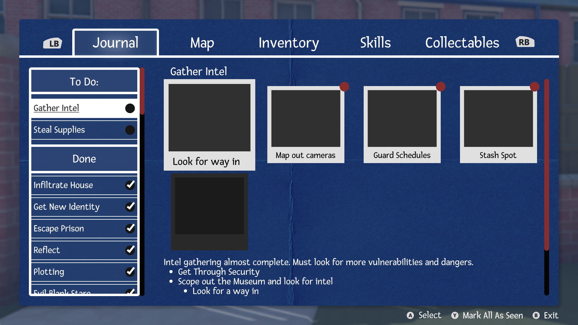
The player’s menu is designed to look like a blueprint with collected intel and clues resembling photographs and checklists.
Reducing Cognitive Load
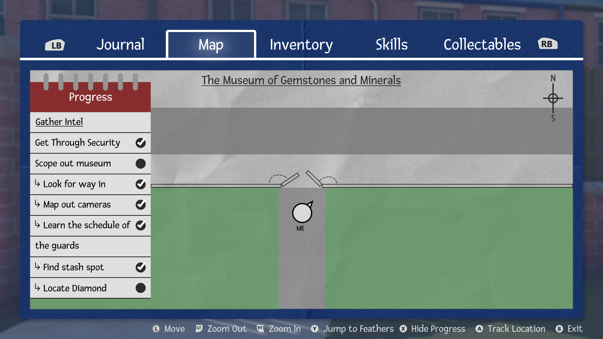
When possible, I included features to lead player actions and reduce cognitive load. The checklist of the currently tracked objective in the map aims to help guide the player onto their next task.
Before starting actual design work, I had to have at least a general idea of how the game would be structured. To help me with this process, I created a feature map as well as a sitemap of the player menu.
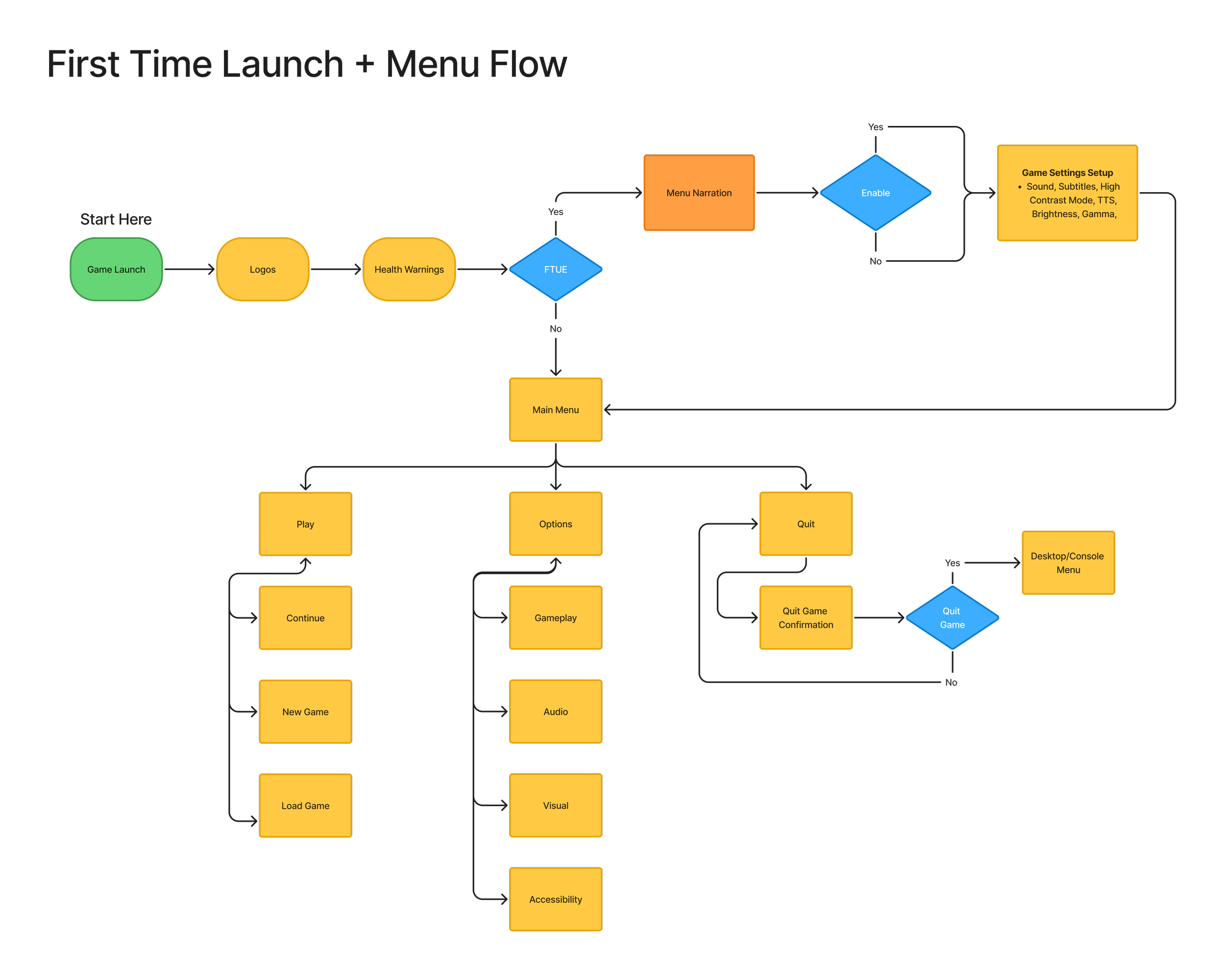
The flows I decided to focus on were for players that would be launching the game for the first time. So the first time setup, and tutorialization of features.
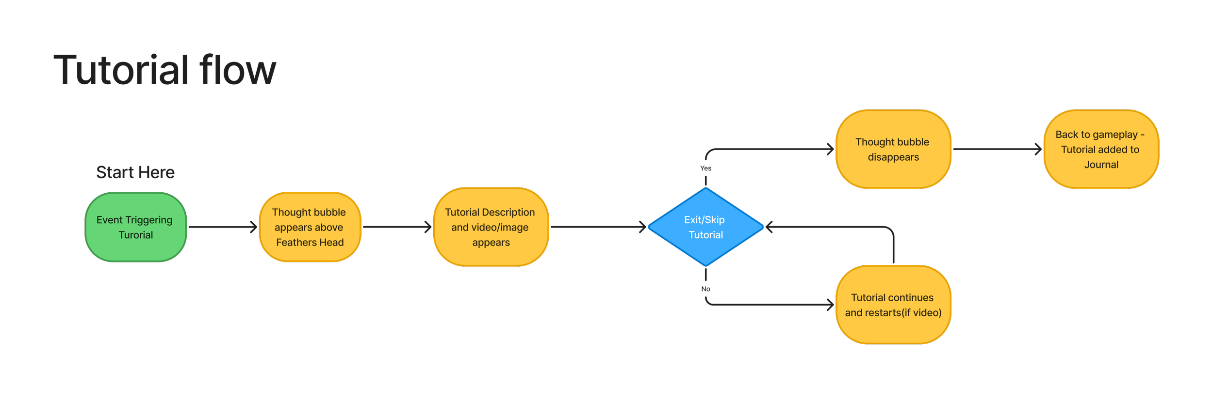
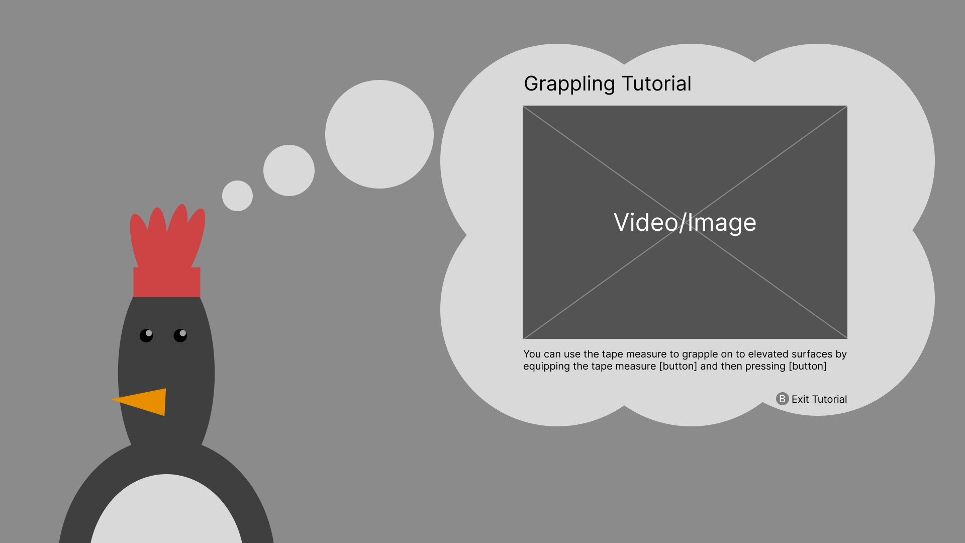
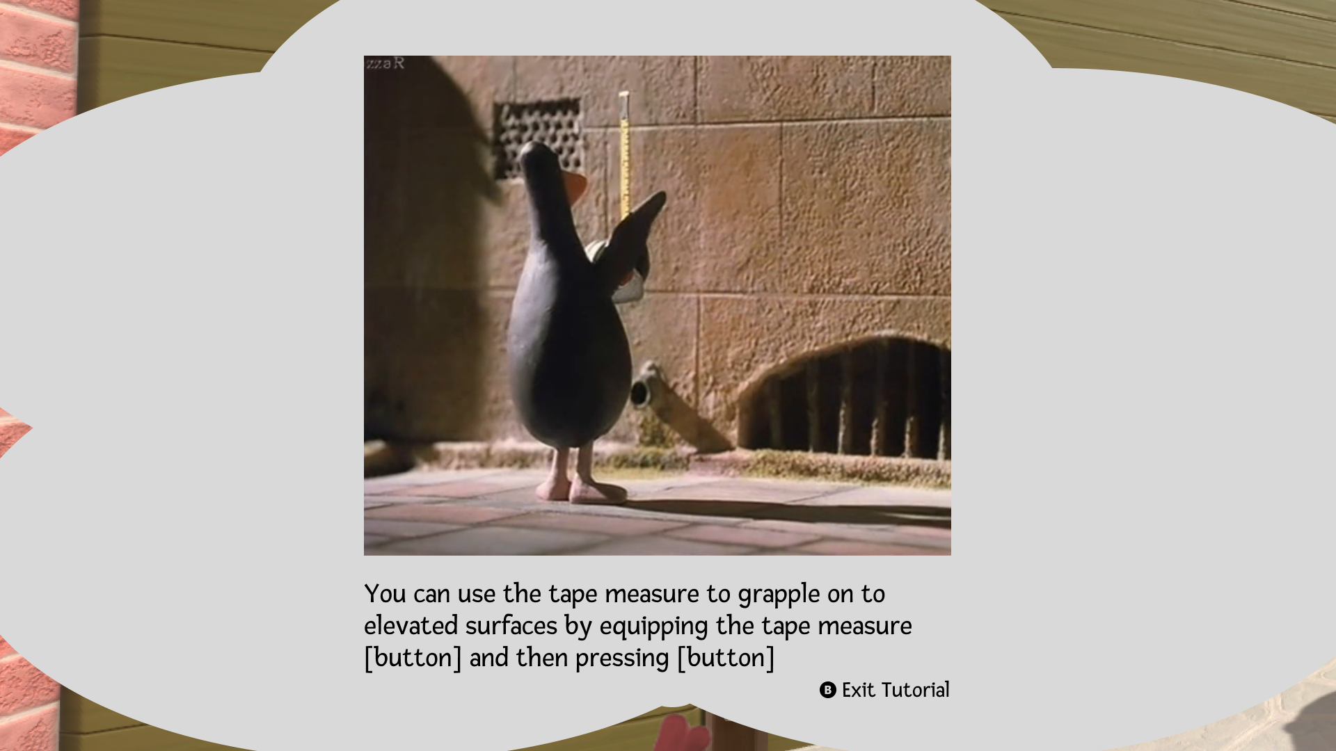
For tutorializing important/more complicated features, a thought bubble style video plays.
The video tutorial will keep playing until the player exits the tutorial, I avoided ending the tutorial automatically in case the player would need more time to process the information.
After exiting or skipping the tutorial, there will be a side panel notifying the player that the tutorial has been added to the tutorial section. This also helps cases where the player would have skipped the tutorial by accident
Journal
HUD & Item Wheel

Flow of important features

Map
Tutorial
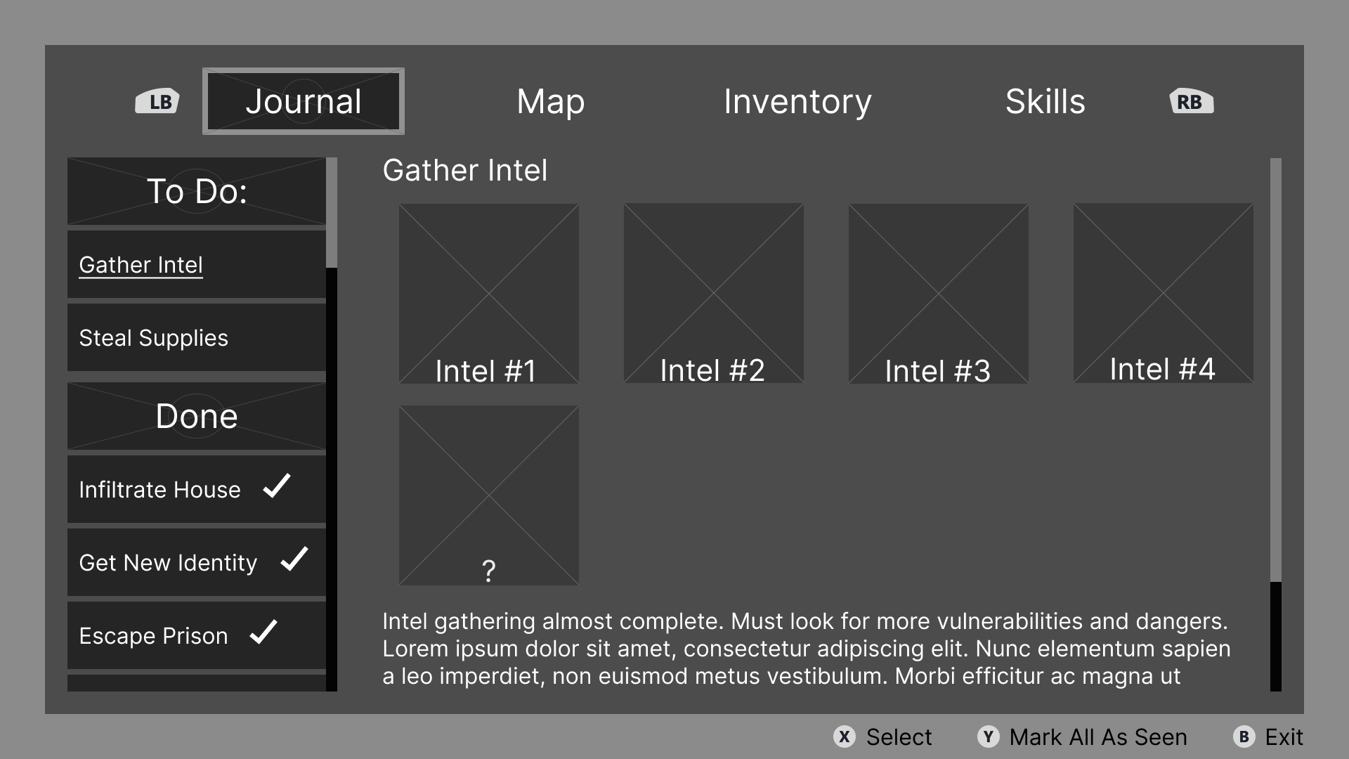
Iterative Design Example: Journal
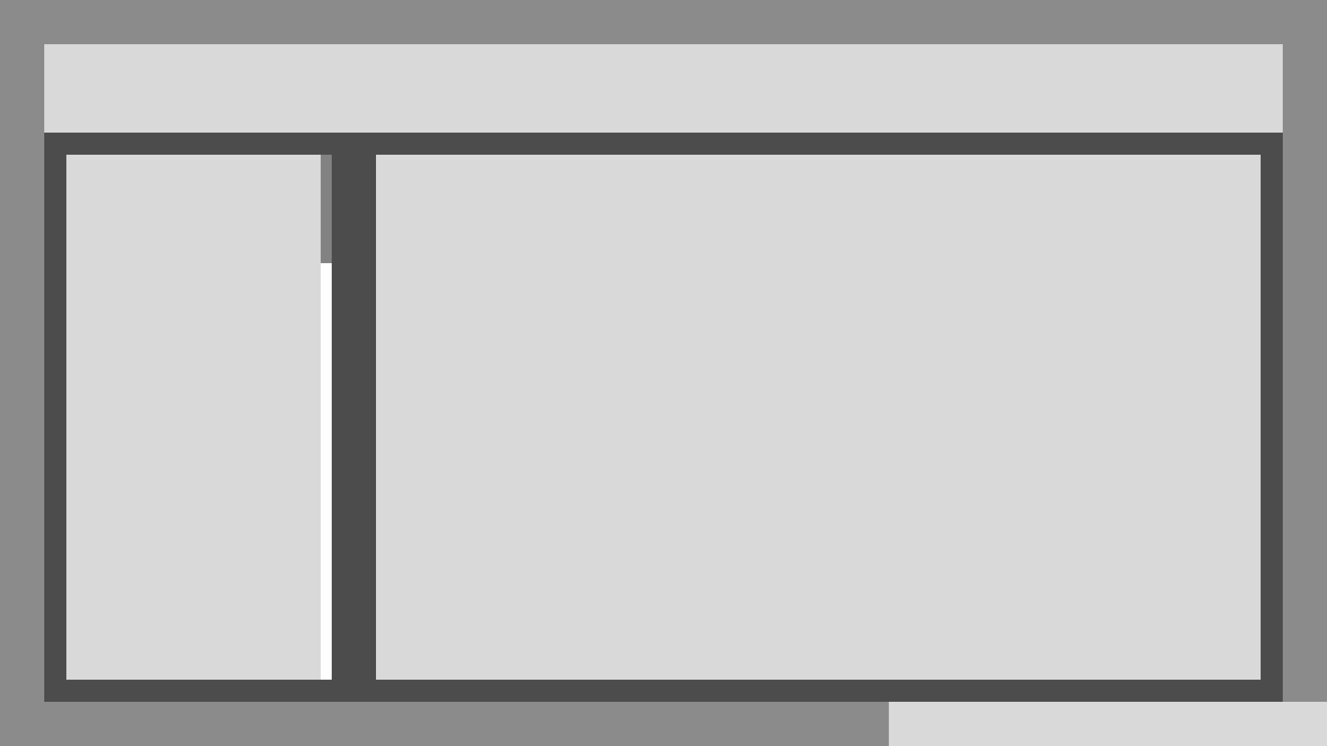
Version 1
Using the outline from blocking out the page, I put in more details and features that I want to put into the screen. During this step I try not to focus on working with too much detail and instead embrace the unknown as a step to get closer to what I want
So one of the issues that stood out to me right away were the checkmarks being too dependent on the string length of the mission, causing it to be inconsistent in placement.

UI Art pass
Using Figma, I created the UI art and made it semi-diegetic. I made the player menu in the style of blueprints to fit thematically with the characters meticulous nature.
Final Thoughts
Menu narration being included in the first time setup is extremely important as it is the feature that’s hardest to navigate to if one needs it.
After the menu narration, the game will take the player to the settings page where they are able to adjust; sound, subtitle, contrast mode, brightness, and graphical settings.
High Fidelity Wireframes


Exploration and Blocking
Design explorations and blocking are some of the first parts of designing that I do. They allow me to get every idea I have out there, good and bad, to see which parts work, and which ones might not
After a few iterations
A few iterations later, I’ve added more detail, features, and quality of life improvements.
The checkmarks are now fixed to the box rather than the string to make the placements more consistent and I added empty slots to make it more obvious that those tasks are not yet complete
I had an incredibly fun time creating this game concept and found it rewarding to put this on the portfolio you are now reading. The challenge of trying to create features to be more diegetic was interesting and brought solutions that I’m personally very proud of.
Outside of settings there are a few ways that I really wanted to implement accessibility by default. One of the ways I did this was to not obscure text. So no crossing out with lines, no darkening, and always have contrast. Although not perfect, I would love to revisit this and try to find and include more ways to increase accessibility in my designs.
For future projects (or perhaps even this one) I would love to have a chance for people go through some of the prototypes and get some feedback.
If you’d like to talk more about this project or others, please reach out! I’d love to chat :D
Wallace & Gromit and related characters are the property of Aardman Animations. This project is a non-commercial fan concept created for portfolio purposes only.
Screenshots of characters and backgrounds are from Wallace & Gromit: The Wrong Trousers and PowerWash Simulator