Death Stranding
Accessibility Case Study Overview
With my excitement for Death Stranding 2’s release on the PC, I decided to replay the first Death Stranding.
As I was playing, I decided this time to choose a few screens that I thought could benefit from an accessibility pass and a slight redesign without overhauling the whole thing.
The research and resources I used for the accessibility pass include:
My Role
UX Designer
Created alternate versions of existing screens with adjustments to enhance accessibility
Objective
To do an accessibility pass on some of the screens and adjust them to create better experiences for the player.
*Adjust them without completely redesigning the screens
Concerns & Adjustments
Adjustments
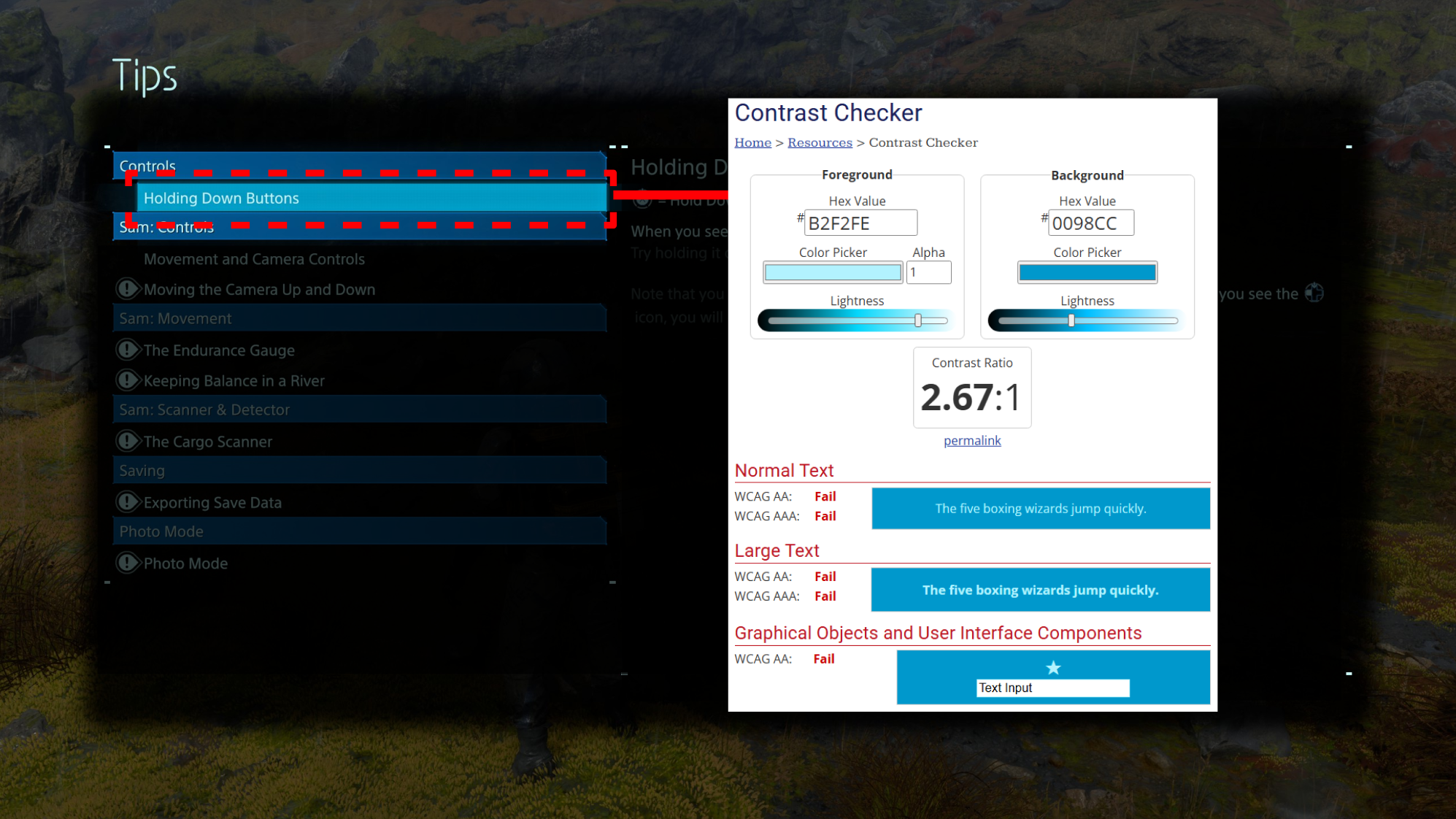
Font & background combination that passes contrast requirements
A visually static option selector to avoid flashing/pulsating effect
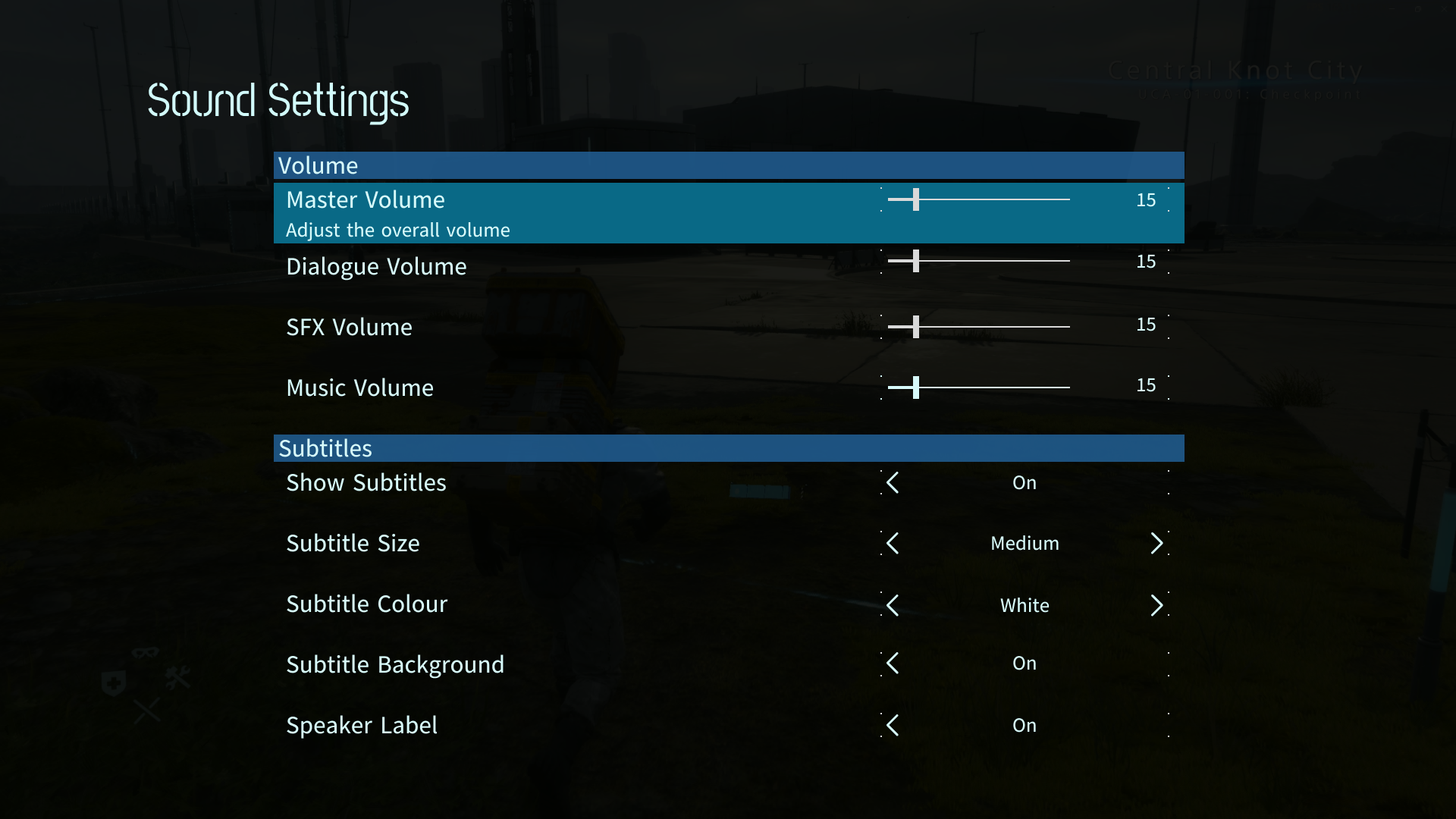
Added more options to the sound setting to improve overall experience
Previously only had 3 options (Subtitle toggle, size, and master volume)
Adjustments
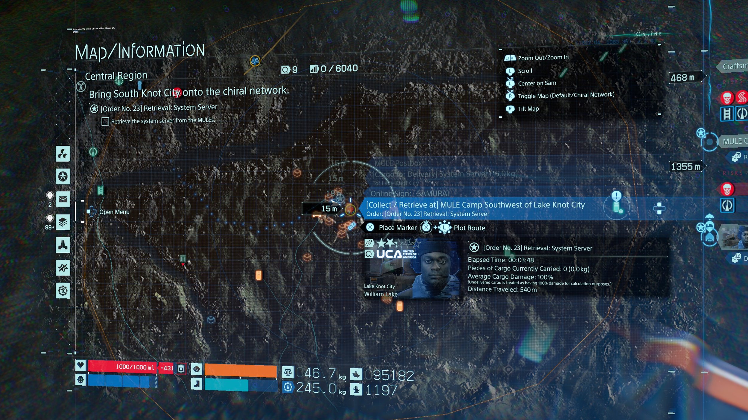
Added darkened and blurred layer behind texts to improve legibility
Added labels to the menu on the left to make the selections more clear
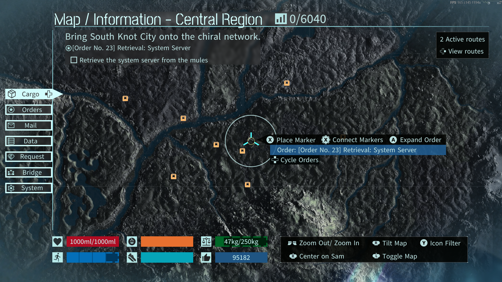
Moved information around and put them in expandable menus to reduce visual clutter on the map
Included dashes on the edges of the status bar to clearly differentiate sections that are full vs partial
Adjustments
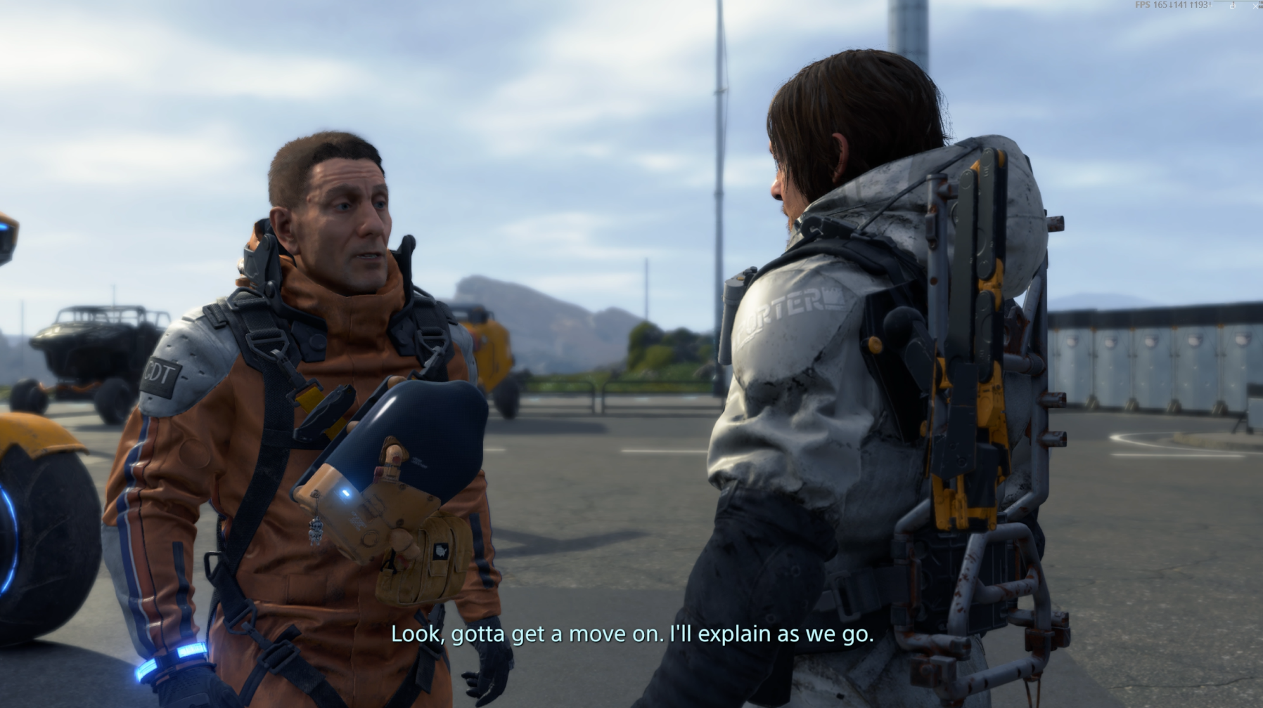
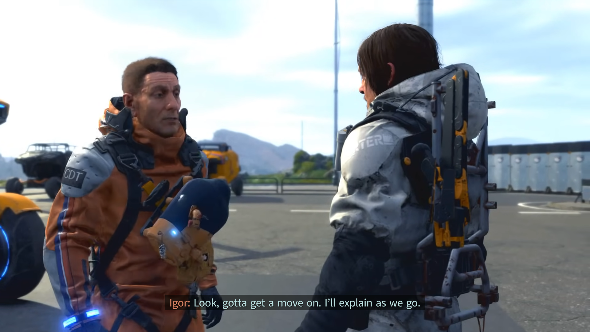
Added speaker label for clear distinction of who’s speaking
Added translucent background behind text for improved contrast and legibility
Tools
Figma
Concerns
The contrast of the text and the selection box is quite low, making it difficult to read
The box also has a pulsating effect which can make it harder to read
Concerns
The lack of speaker labels can make dialogue confusing for people deaf and hard of hearing, as well as anyone who may need it
Subtitles can get obscured depending on the background of the game
No options to change the colour of the subtitles
Concerns
Low text legibility
Decorative elements on map screen add to visual clutter
Overwhelming amount of information on screen
Status bars on bottom left can be unclear (full vs partial)